
4 Tips for Personal Branding as a Graphic Designer (With Examples)
Personal Branding for Designers: 4 Simple Tips to Get Started Without Overthinking It
If you’re a graphic designer, branding for other people probably feels natural. But when it comes to your own personal brand? Total brain fog.
You’re not alone—most designers agree that personal branding is tough. It’s easy to overthink, hard to commit, and tempting to constantly tweak. But here’s the good news: it doesn’t have to be perfect to be powerful.
Here are four quick tips to help you create a personal brand that’s simple, strong, and built to grow with you.
Want to see the brands in action?
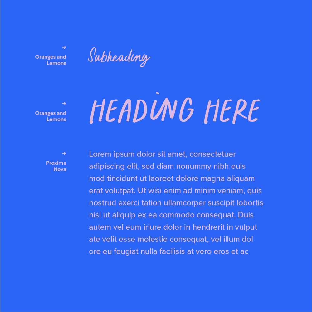
Scroll to the bottom of this post for all the brand board goodness! I’ve included the logos, colours (with colour codes!), the photography moodboards and even the font hierarchy and font names.
How to Keep It Simple and Effective
Tip 1: Keep Your Logo Simple
This might feel counterintuitive as a designer, but trust me—you don’t need an award-winning logo for yourself.
In fact, a clean, minimal logo will give your brand flexibility as you grow, evolve, and explore new styles. Your logo doesn’t have to showcase everything you can do. That’s what your portfolio is for.
Think of it as the container, not the content.
Tip 2: Use Colour to Show Personality
Instead of relying on complex graphics or illustrations, use colour as your main brand signal. Whether you’re bold and high-contrast or soft and neutral, colour is one of the easiest ways to:
Show your style
Stand out
Stay flexible over time
Plus, it makes it easier to create consistent social content, mockups, and assets that feel on-brand without feeling forced.
Tip 3: Invest in Brand Imagery
If you’re not ready to lock down your entire brand aesthetic, focus on creating a solid base of imagery—like from a brand photo shoot or a well-styled DIY session.
This means:
You can update your fonts or graphics later
But your visual presence still feels consistent
Great for social media, portfolio sites, and client-facing platforms
Tip within a tip: use natural light, minimal props, and outfits that reflect your brand palette.
Tip 4: Choose Fonts That Fit (But Keep It Readable)
Typography is powerful—but for personal branding, keep it clear and intentional.
Use:
A hero font that reflects your personality or vibe
A clean, legible supporting font for body copy, buttons, or site content
The key is contrast and cohesion. If your fonts feel like you but are still easy to read, you’ve nailed it.
Final Thought: Keep It Simple So You Can Grow
You can always evolve your branding later. The best thing you can do now? Start simple and consistent. Make it easy for potential clients to recognise your work, connect with you, and understand what you do best.




Want More Time-Saving Tools and Freebies?

This process is just one of the techniques I share across my design templates and digital assets, made especially for designers who want professional results—without starting from scratch every time.

Close high-value brand & design clients with a proposal system built for strategy.
A Project Proposal template created for brand designers, strategists and creative studios that matches the high quality of your work. Designed with a modern, editorial aesthetic and a clear layout grid, this Studio Project Proposal Template gives independent designers and creative agencies the exact framework needed to present five-figure project scopes with complete confidence.
Built natively in both Adobe InDesign and Adobe Illustrator, this template goes beyond empty layout frames. It includes actual strategic content frameworks such as pathway decision trees, detailed phase timelines, scope lists, and 3-tier pricing tables, to help you clearly articulate your value and guide prospective clients to a fast "yes."
Includes 29 thoughtfully structured pages, multiple layout options and a fully written example proposal to help you shape your own content.
Built for Both InDesign & Illustrator Users
Real Strategic Copy Framework: Fully written example brand proposal
Grid Editorial Layout: Designed with strict typographic hierarchy, generous whitespace, and versatile image spreads that put your work front and center.
1080 × 1920 px format, 29 pages with multiple spread options
Adobe Fonts used
This is a digital product. No physical item will be shipped. Photographs, logos and mockup imagery shown in the product previews are for demonstration purposes only and are not included unless otherwise stated. Please review the software requirements and licence terms before purchasing.